Overview
The ggaib package provides ggplot2 themes and color
scales for the Annenberg Institute at Brown University. It includes
three theme variants and discrete, continuous, and diverging color
scales using the Institute’s brand palette.
Brand Colors
Access the full palette or select specific colors:
aib_colors()
#>      navy       red   emerald    yellow       sky     taupe     brown      gray
#> "#1B3E6F" "#C00404" "#00AF9A" "#EBA900" "#55C8E8" "#B6B09D" "#503629" "#97A3AE"
aib_colors("navy", "red", "emerald")
#>      navy       red   emerald
#> "#1B3E6F" "#C00404" "#00AF9A"
Themes
There are three core themes included in the ggaib
package, each optimized for a different use case. All themes share the
same base font and color palette, but differ in gridline and axis
styling to suit different types of visualizations.
Publication (default)
set.seed(42)
districts <- data.frame(
  spending = c(rnorm(40, 11, 2), rnorm(40, 15, 2.5), rnorm(40, 13, 3)),
  avg_score = c(rnorm(40, 250, 15), rnorm(40, 270, 12), rnorm(40, 258, 18)),
  urbanicity = rep(c("Urban", "Suburban", "Rural"), each = 40)
)

ggplot(districts, aes(spending, avg_score, color = urbanicity)) +
  geom_point(size = 2) +
  scale_color_aib() +
  scale_x_continuous(labels = aib_label("dollar")) +
  scale_y_continuous(limits = c(215, 300), breaks = seq(200, 300, 20)) +
  labs(
    title = "Per-Pupil Spending and Math Achievement",
    x = "Per-Pupil Expenditures\n($1,000s)",
    y = "Avgerage Math Score",
    caption = "Note: Simulated data for illustration"
  ) +
  theme_aib() +
  aib_color_title(
    "For Urban, Suburban, and Rural school districts",
    colors = c(
      "Urban"    = unname(aib_colors("navy")),
      "Suburban" = unname(aib_colors("red")),
      "Rural"    = unname(aib_colors("emerald"))
    ),
    element = "subtitle"
  ) +
  theme(legend.position = "none")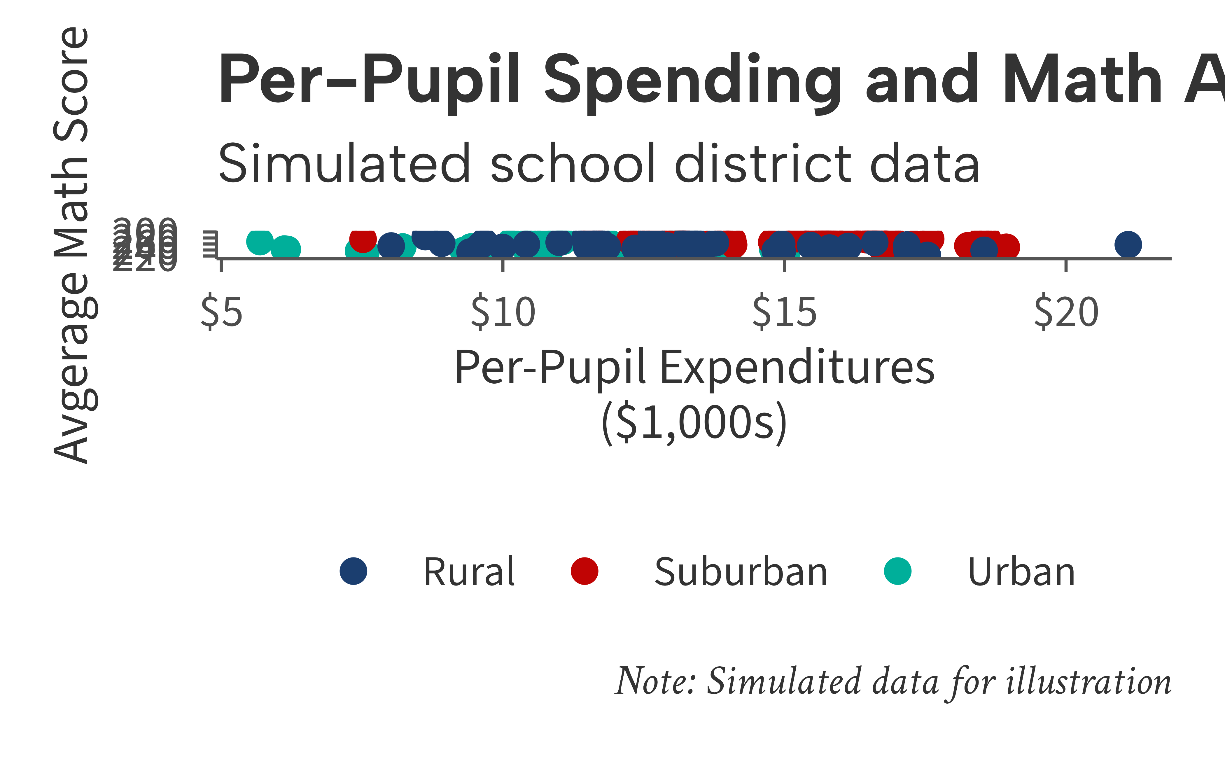
Grid
set.seed(42)
years <- 2005:2023
gap_data <- data.frame(
  year = rep(years, 2),
  group = rep(c("Higher-Income", "Lower-Income"), each = length(years)),
  score = c(
    270 + cumsum(rnorm(length(years), 0.3, 0.8)),
    240 + cumsum(rnorm(length(years), 0.8, 0.9))
  )
)

ggplot(gap_data, aes(year, score, color = group)) +
  geom_line(linewidth = 1) +
  scale_color_aib() +
  scale_x_continuous(breaks = seq(2005, 2025, 3)) +
  labs(
    title = "Reading Achievement Gap Over Time",
    x = NULL,
    y = "Average Reading Score"
  ) +
  theme_aib_grid() +
  aib_color_title(
    "Higher-Income and Lower-Income 4th-grade scores",
    colors = c(
      "Higher-Income" = unname(aib_colors("navy")),
      "Lower-Income"  = unname(aib_colors("red"))
    ),
    element = "subtitle"
  ) +
  aib_direct_label(gap_data, "year", "score", "group",
                   limits = c(215, 300), breaks = seq(200, 300, 20))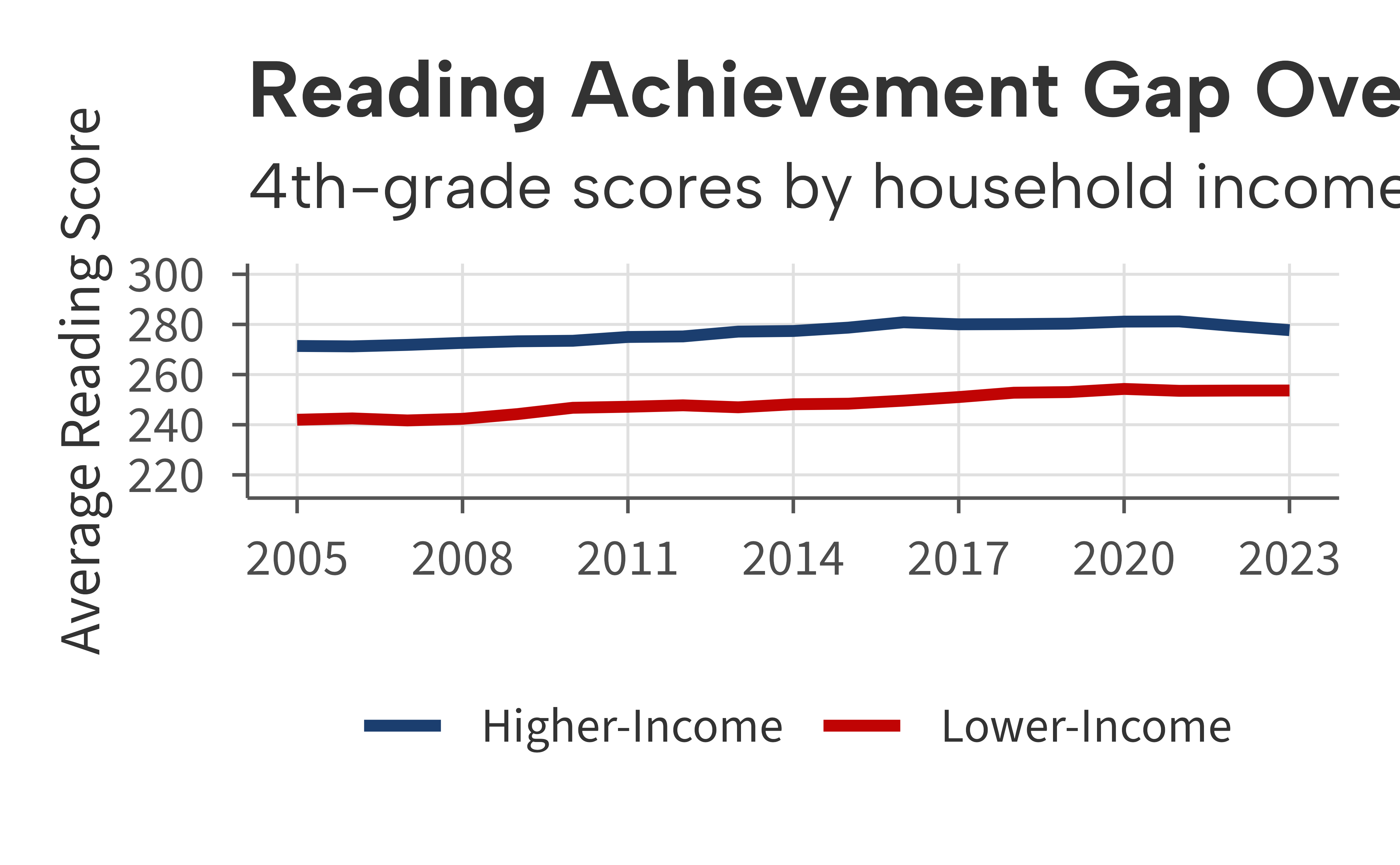
Map
set.seed(42)
states <- ggplot2::map_data("state")
spending_by_state <- data.frame(
  region = unique(states$region),
  spending = runif(length(unique(states$region)), 7, 24)
)
map_df <- merge(states, spending_by_state, by = "region")

ggplot(map_df, aes(long, lat, group = group, fill = spending)) +
  geom_polygon(color = "white", linewidth = 0.2) +
  scale_fill_aib_c() +
  labs(
    title = "Per-Pupil Spending by State",
    fill = "$ (1,000s)",
    caption = "Note: Simulated data for illustration"
  ) +
  coord_fixed(1.3) +
  theme_aib_map()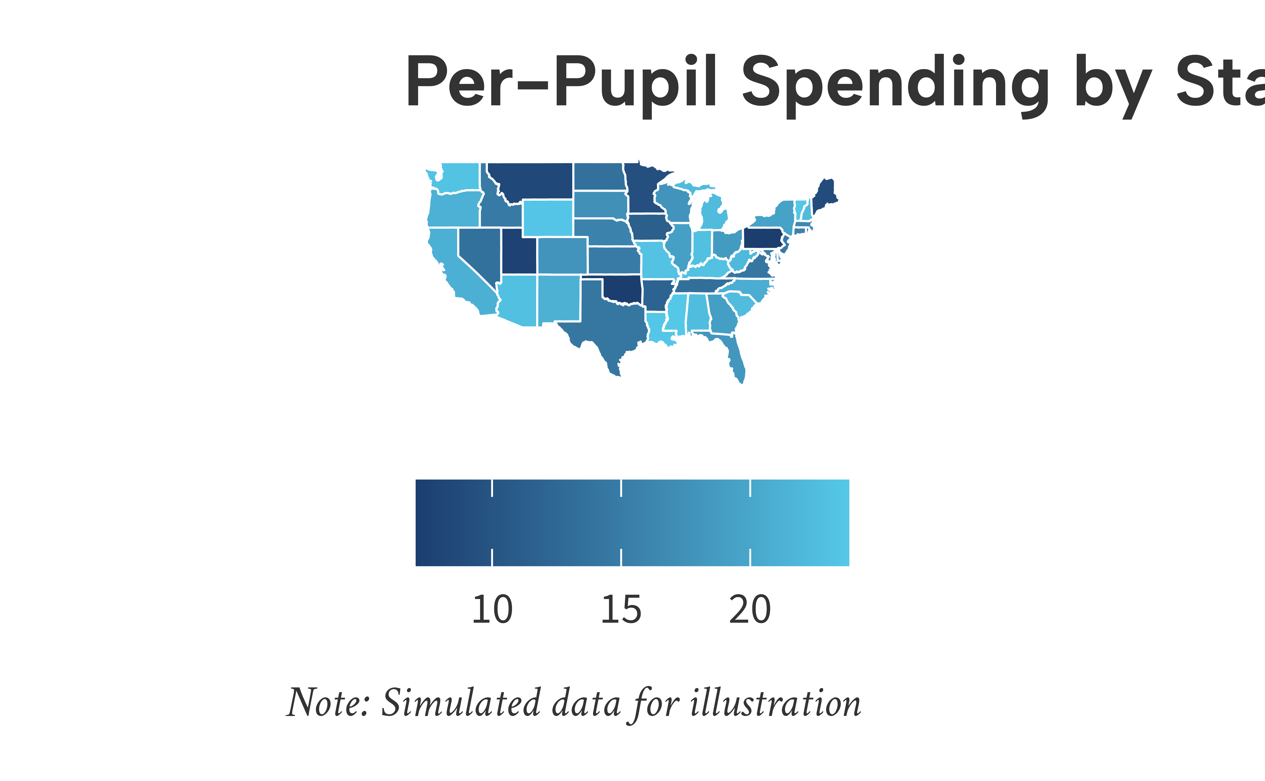
Color Scales
Continuous
set.seed(42)
schools <- data.frame(
  enrollment = runif(80, 200, 1500),
  avg_score = rnorm(80, 260, 20),
  st_ratio = runif(80, 10, 30)
)
schools$avg_score <- schools$avg_score - (schools$st_ratio - 20) * 1.5

ggplot(schools, aes(enrollment, avg_score, color = st_ratio)) +
  geom_point(size = 2) +
  scale_color_aib_c() +
  scale_x_continuous(labels = aib_label("comma"), breaks = seq(0, 1500, 300)) +
  scale_y_continuous(limits = c(215, 300), breaks = seq(200, 300, 20)) +
  labs(
    title = "Student-Teacher Ratio Across Schools",
    x = "Enrollment",
    y = "Avg. Test Score",
    color = "Student-Teacher\nRatio"
  ) +
  theme_aib()
#> Warning: Removed 3 rows containing missing values or values outside the scale range
#> (`geom_point()`).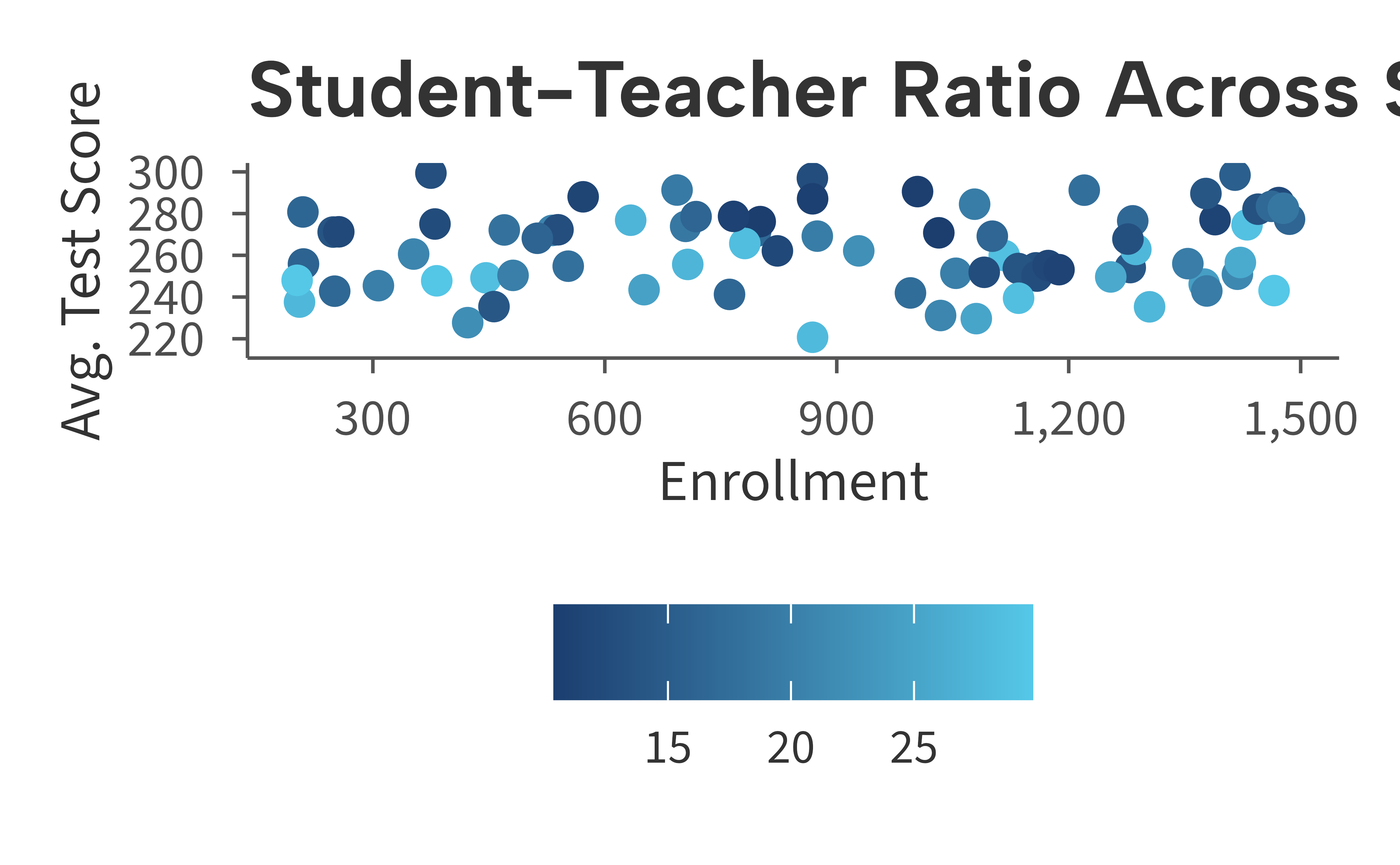
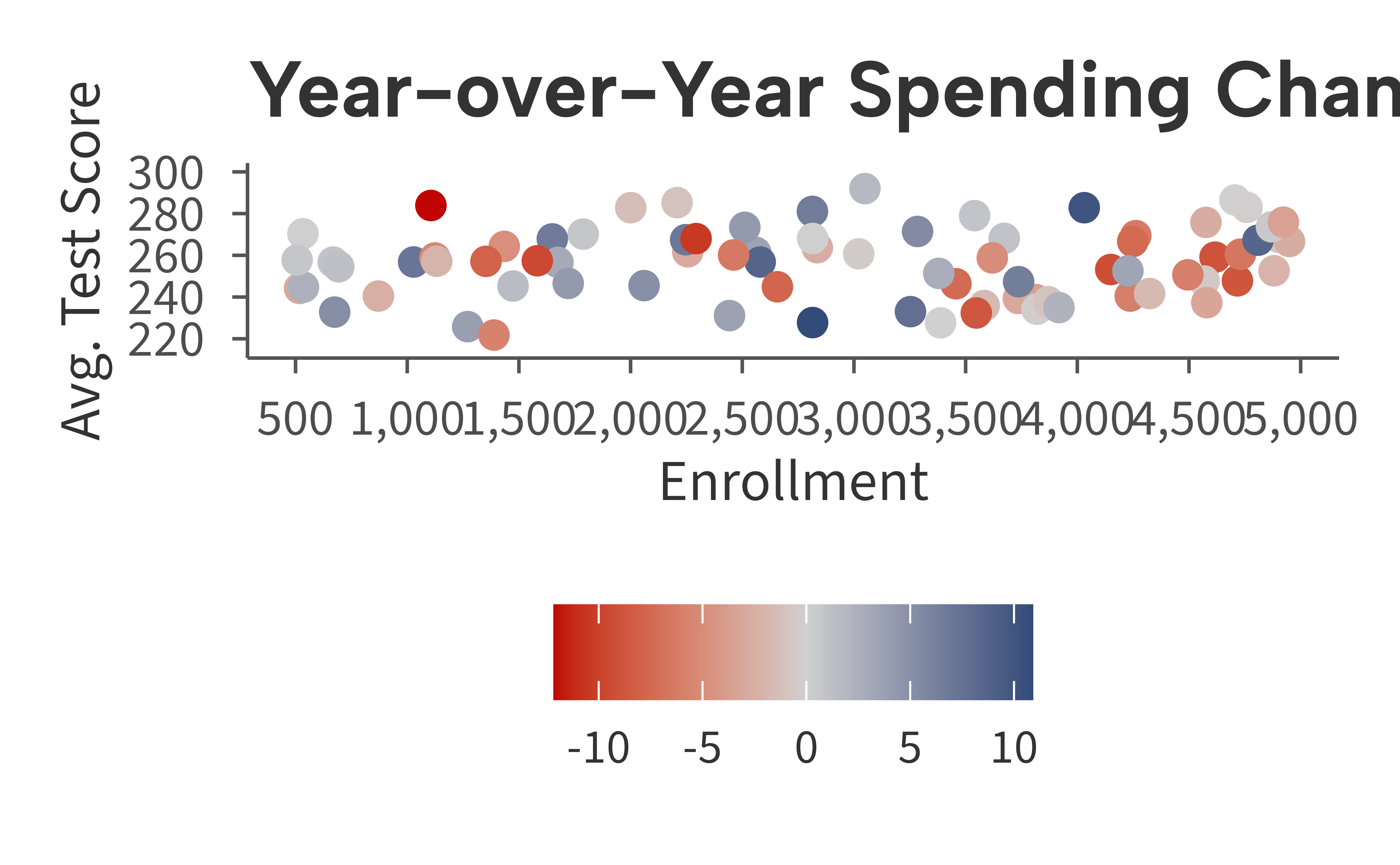
Diverging
set.seed(42)
districts2 <- data.frame(
  enrollment = runif(80, 500, 5000),
  avg_score = rnorm(80, 255, 20),
  spending_change = rnorm(80, 0, 6)
)

ggplot(districts2, aes(enrollment, avg_score, color = spending_change)) +
  geom_point(size = 2) +
  scale_color_aib_div() +
  scale_x_continuous(labels = aib_label("comma"), breaks = seq(0, 5000, 500)) +
  scale_y_continuous(limits = c(215, 300), breaks = seq(200, 300, 20)) +
  labs(
    title = "Year-over-Year Spending Change",
    x = "Enrollment",
    y = "Avg. Test Score",
    color = "Spending\nChange (%)"
  ) +
  theme_aib()
#> Warning: Removed 2 rows containing missing values or values outside the scale range
#> (`geom_point()`).